FiniteCurve.com: TSP art on a CPU budget

tl;dr: My hobby project FiniteCurve.com is a web app that draws an image with a single, long, non-intersecting line. This post explains the process.

Like many engineers, I’ve had a long standing fascination with mazes. One manifestation of this was elementary school drawings of ever-winding but never overlapping lines, like this:

They were fascinating to look at but tedious to draw. When I learned programming a few years later, I wrote many grid-based maze generators. However, while I’ve pondered the problem every several years since, I never ended up writing one that could replicate that organic, free-flowing, space filling style.

That is, until recently.

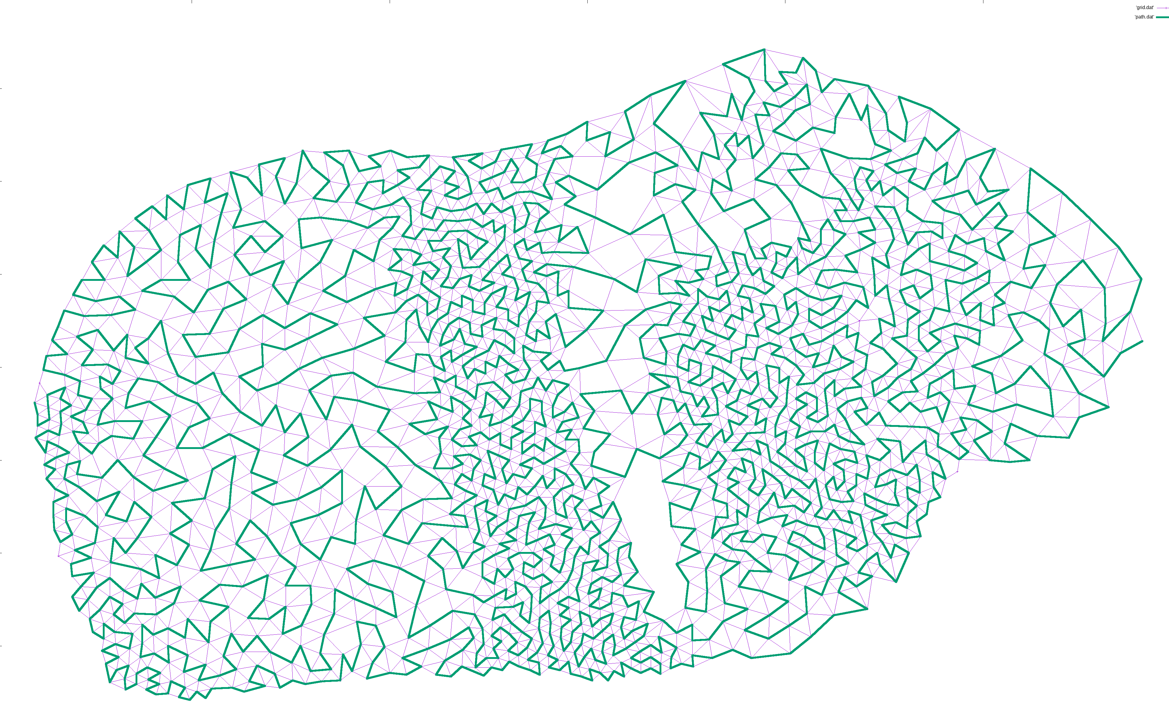
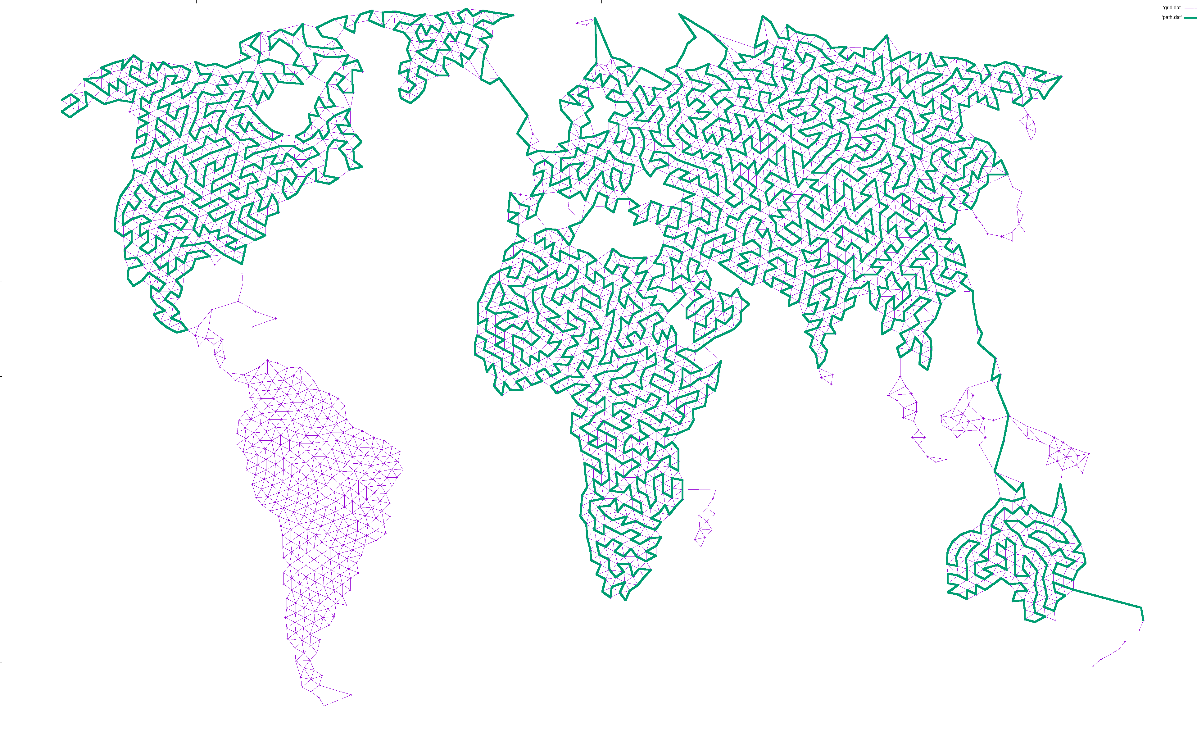
After 20 years, my pondering coincided with a blank spot on my wall, and I finally decided to implement it. Here’s Central Europe drawn with a single, ever-winding line. Click to see the entire world (10000×5000, 4MB).

Central Europe drawn as a single line

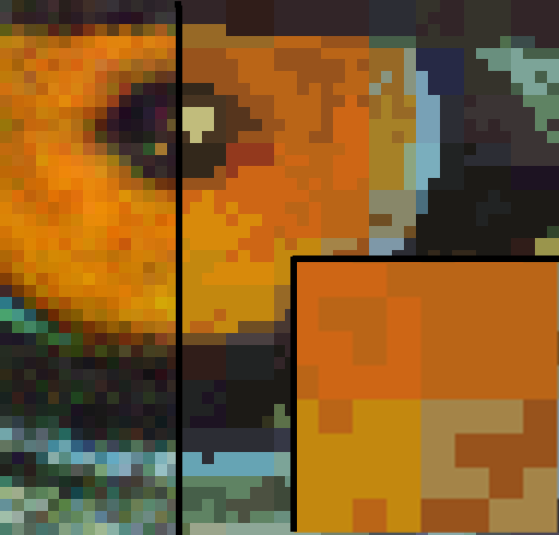
The actual artwork I put on my wall — which looks better in person but doesn’t convey the concept as convincingly in a blog post — was of my guinea pig. Maze obsession aside, my favorite part is how discoverable it is:

Guinea pig drawn with a single line

It looks like a grayscale photo from a distance, but as you get closer you realize that it’s made up of something, thereby inviting you to get closer still until you have your nose pressed up against it, tracing the 160 meter line around.

I never intended to publish the program, but the result was striking enough that I compiled the C++ code to Wasm via emscripten, added a scrappy frontend, and put it online. You can play around with it on FiniteCurve.com. The source code is koalaman/finitecurve.com on GitHub.

I was not aware of this until I after I finished it, but this style closely resembles what’s known as "TSP art". Traditionally, it’s done by laying out points with a density according to a grayscale image, solving the Traveling Salesman Problem, and graphing the result.

Of course, even approximating TSP is hard, so generating such images takes minutes for smaller ones and days for large ones.

Since I only cared about the visual impression and not about the optimality or completeness of the resulting path, I just used some ad-hoc heuristics. The tool runs in seconds.

A keltic knot, but even knottier as thick bands are drawn with a single, space filling line

So how does it work?

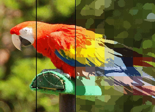
The general approach is to generate a point cloud with a density matching a grayscale input image, and finding something close to a Hamiltonian path that doesn’t cross itself.

It’s a short description, but there are multiple noteworthy details:

  • The path does not need to be short, as it would in the Travelling Salesman Problem. Arguably, the longer the better.
  • The path must not cross itself. A TSP solution under triangle inequality will get this for free, but we have to work for it.
  • The path does not need to be complete. In fact, it shouldn’t be. Any far-away point is better left unvisited to avoid causing unsightly artifacts. Unvisited central points will merely cause small visual glitches.
  • It’s a path and not a cycle. Not because it’s easy, but because it’s hard. A visual cycle can trivially be created by tracing the circumference of a spanning tree in O(n) time, and where’s the fun in that?

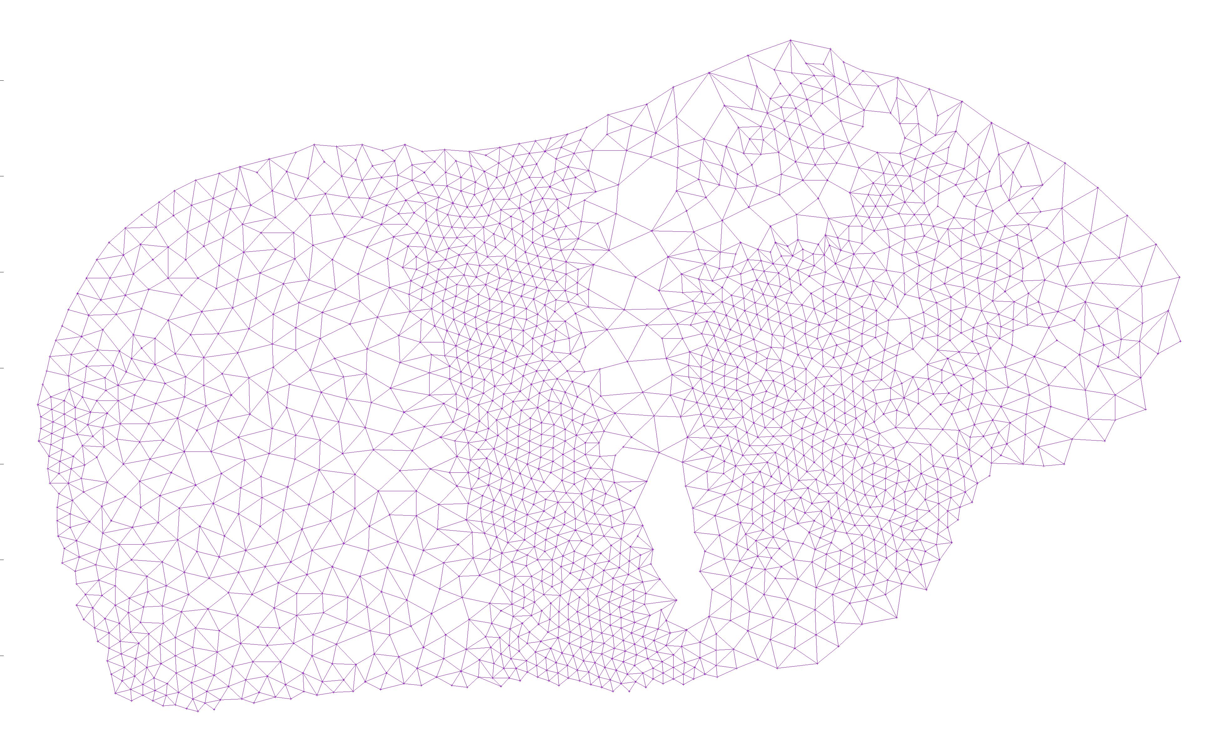
To generate a point cloud, I simply went over each pixel in a grayscale input and added a vertex there if there wasn’t already one within some distance d determined by the shade of the pixel:

A point cloud resembling a guinea pig

I then added edges from each node to all nearby nodes, as long as the edge did not cross an existing edge. This way, there would be no crossing edges, so any Hamiltonian path would avoid crossing itself:

A grid resembling a guinea pig

I then designated an arbitrary start point and an end point. The exact points don’t matter, but for ease of locating them, I picked the left-most and right-most points, and used plain ol’ depth first search to find a path between them:

A grid still resembling a guinea pig, with a meandering line from butt to snout

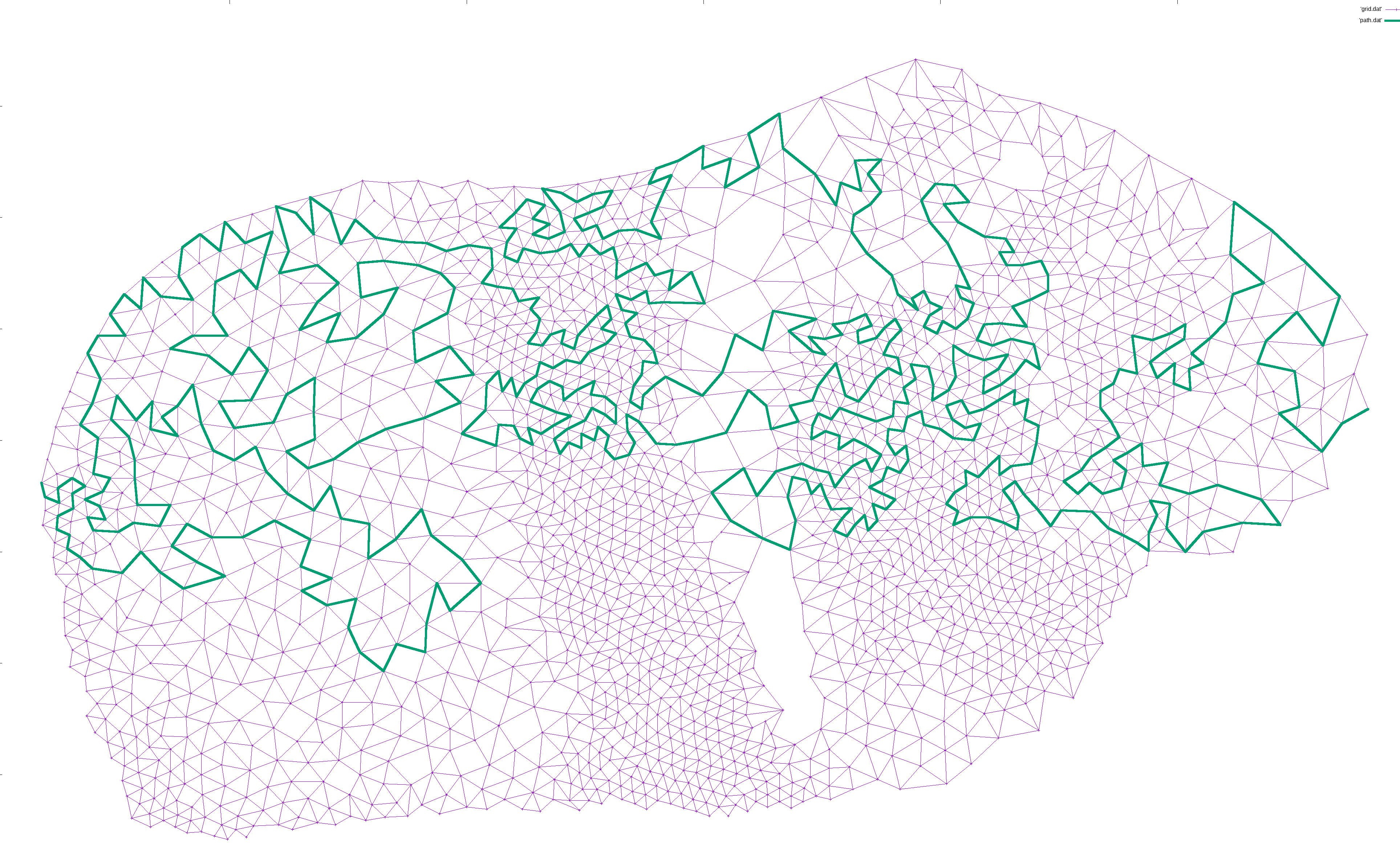
I would then iteratively expand the path. For each pair of points (p1, p2) along the path, I would find a neighbor n of p1 and try to find a path from n to p2. If found, I would expanded the path from p1->p2 to p1->n->...->p2, which is guaranteed to be longer in terms of nodes. This way, the path gradually lengthened to cover most of the nodes:

A grid still resembling a guinea pig, with an even longer meandering line from butt to snout

The line keeps getting longer!

A long meandering line now completely space filling the outline of a guinea pig

This is enough for well connected graphs.

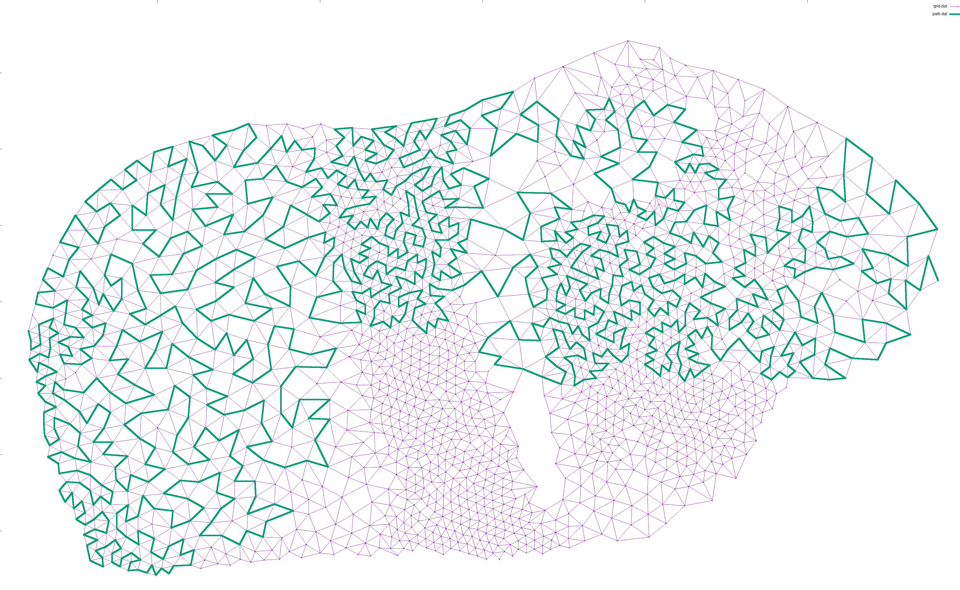
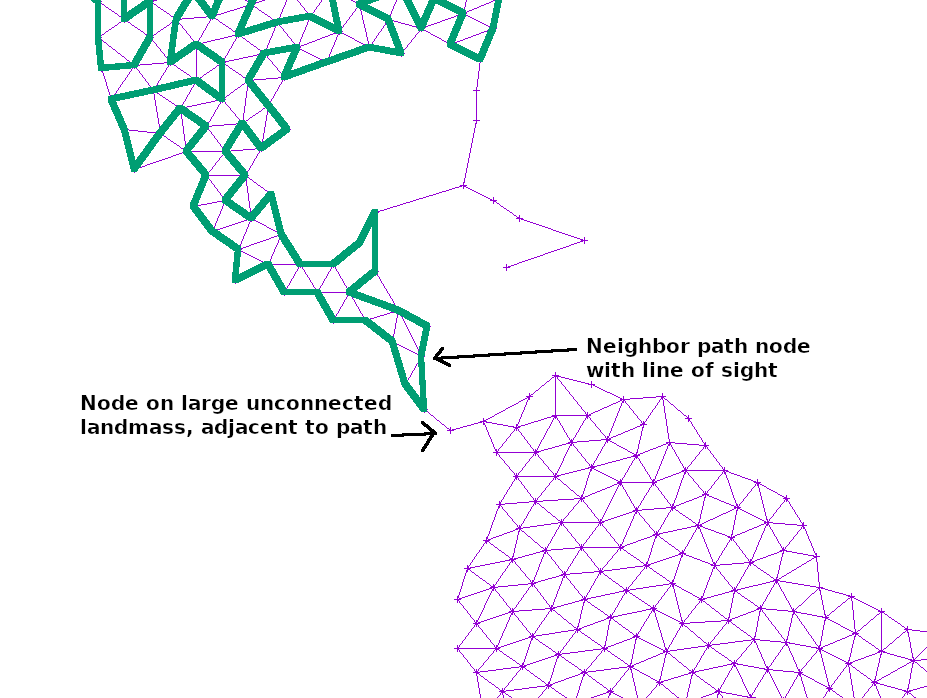
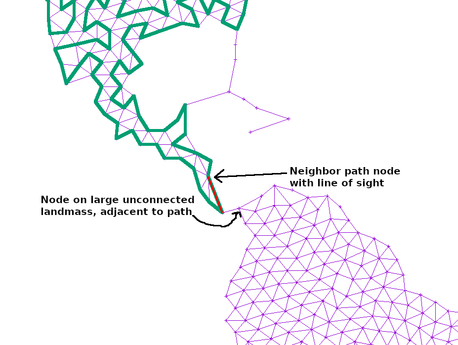
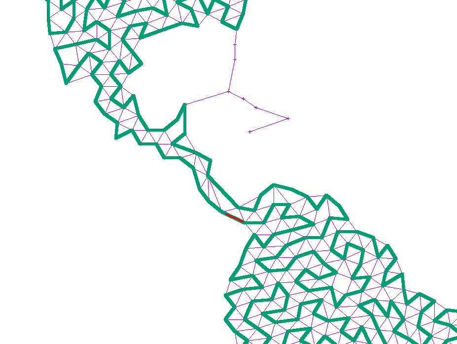
For disjoint graphs, such as a world map, I simply added the shortest edge that would connect the disjoint regions together. This ensures that a path exists between the start and end, but necessarily leaves large island unconnected since there is only a single bridge there:

A world map with a line meandering from Alaska to New Zealand, but missing South America

If the path at any point touched a large, unexplored section of the graph, I simply added another edge from the neighbor or neighbor’s neighor to that point. That way, any such island would slowly become reachable:

A path through Latin America, but stopping short of South America because the grid is only connected by a single edge

A path through Latin America, but stopping short of South America because the grid is only connected by a different, single edge, slightly closer to Colombia

A path through Latin America, now going down into Columbia and space filling all of South America

A path through Latin America, now going down into Columbia and space filling all of South America

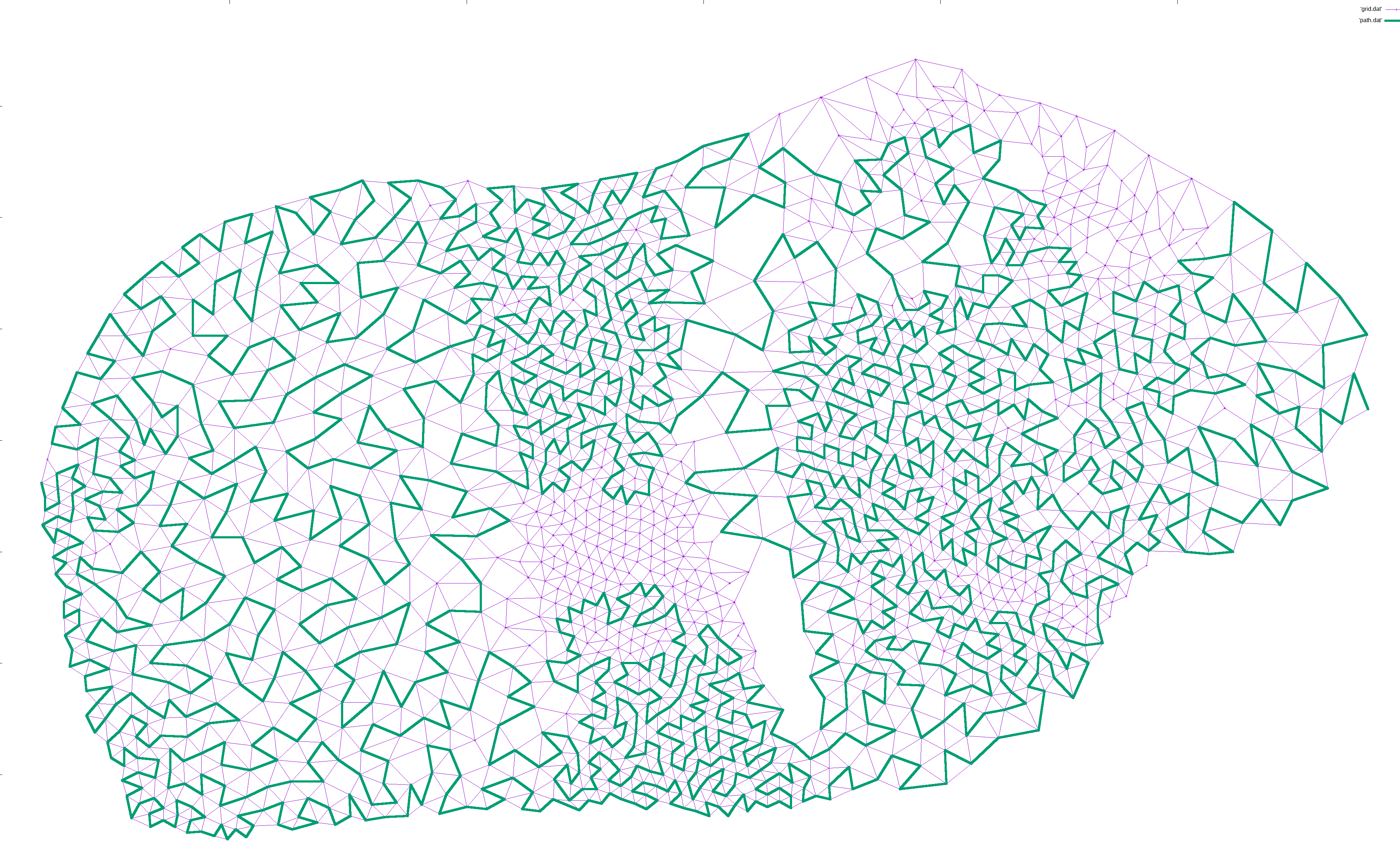
Finally, the curve is smoothed from simple, linear segments into Catmull–Rom splines, and then mapped into Cubic Bezier splines that can easily be rendered in SVG.

There is some additional polish like ignoring areas under a certain size or that are just a long, thin line of points, shuffling to try to avoid holes in the middle of a graph, and pruning edges coming out of a single vertex that are too close in angle, but really — that’s it.

I had a lot of fun hacking this project together, and I still find the result fascinating and captivating. Give it a spin on FiniteCurve.com and see what you think!

(Thanks to gnuplot for its ever invaluable plots, both for debugging, and for the illustrations in this post)

Use echo/printf to write images in 5 LoC with zero libraries or headers

tl;dr: With the Netpbm file formats, it’s trivial to output pixels using nothing but text based IO

To show that there’s nothing up my sleeves, here’s an image:

A computer generated image of gently shaded, repeating squares

And here’s the complete, dependency free bash script that generates it:

#!/bin/bash
exec > my_image.ppm    # All echo statements will write here
echo "P3 250 250 255"  # magic, width, height, max component value
for ((y=0; y<250; y++)) {
  for ((x=0; x<250; x++)) {
    echo "$((x^y)) $((x^y)) $((x|y))" # r, g, b
  }
}

That’s it. That’s all you need to generate an image that can be read by common tools like GIMP, ImageMagick and Netpbm.

To rewind for a second, it’s sometimes useful to output an image to do printf debugging of 2D algorithms, to visualize data, or simply because you have some procedural pixels you want to put on screen.

However — at least if you hadn’t seen the above example — the threshold to start outputting graphics could seem rather high. Even with a single file library, that’s one more thing to set up and figure out. This is especially annoying during debugging, when you know you’re going to delete it within the hour.

Fortunately, the Netpbm suite of tools have developed an amazingly flexible solution: a set of lowest common denominator file formats for full color Portable PixMaps (PPM), Portable GrayMaps (PGM), and monochrome Portable BitMaps (PBM), that can all be written as plain ASCII text using any language’s basic text IO.

Collectively, the formats are known as PNM: Portable aNyMaps.

The above bash script is more than enough to get started, but a detailed description of the file format with examples can be found in man ppm, man pgm, and man pbm on a system with Netpbm installed.

Each man page describes two version of a simple file format: one binary and one ASCII. Either is completely trivial to implement, though the ASCII ones are my favorite for being so ridiculously barebones that you can write them by hand in Notepad.

To convert them to more common file formats, either open and export in GIMP, use ImageMagick convert my_file.ppm my_file.png, or NetPBM pnmtopng < my_file.ppm > my_file.png

Should you wish to input images using this trivial ASCII format, the NetPBM tool pnmtoplainpnm will convert a binary ppm/pgm/pbm (as produced by any tool including Netpbm’s anytopnm) into an ASCII ppm/pgm/pbm.

If your goal is to experiment with any kind of image processing algorithm, you can easily slot into Netpbm’s wonderfully Unix-y set of tools by reading/writing PPM on stdin/stdout:

curl http://example.com/input.png | 
    pngtopnm | 
    ppmbrighten -v +10 |
    yourtoolhere |
    pnmscale 2 |
    pnmtopng > output.png

Parameterized Color Cell Compression

I came across a quaint and adorable paper from SIGGRAPH’86: Two bit/pixel Full Color Encoding. It describes Color Cell Compression, an early ancestor of Adaptive Scalable Texture Compression which is all the rage these days.

Like ASTC, it offers a fixed 2 bits/pixel encoding for color images. However, the first of many d’awwws in this paper comes as early as the second line of the abstract, when it suggests that a fixed rate is useful not for the random access we covet for rendering today, but simply for doing local image updates!

The algorithm can compress a 640×480 image in just 11 seconds on a 3MHz VAX 11/750, and decompress it basically in real time. This means that it may allow full color video, unlike these impractical, newfangled transform based algorithms people are researching.

CCC actually works astonishingly well. Here’s our politically correct Lenna substitute:

mandrill

The left half of the image is 24bpp, while the right is is 2bpp. Really the only way to tell is in the eyes, and I’m sure there’s an interesting, evolutionary explanation for that.

If we zoom in, we can get a sense of what’s going on:

mandrill_eye

The image is divided into 4×4 cells, and each cell is composed of only two different colors. In other words, the image is composed of 4×4 bitmaps with a two color palette, each chosen from an image-wide 8bit palette. A 4×4 bitmap would take up 16 bits, and two 8bit palette indices would take up 16 bits, for a total of 32 bits per 16 pixels — or 2 bits per pixel.

The pixels in each cell are divided into two groups based on luminosity, and each group gets its own color based on the average color in the group. One of the reasons this works really well, the author says, is because video is always filmed so that a change in chromaticity has an associated change in luminosity — otherwise on-screen features would be invisible to the folks at home who still have black&white TVs!

We now know enough to implement this lovely algorithm: find an 8bit palette covering the image, then for each cell of 4×4 pixels, divide the pixels into two groups based on whether their luminosity is over or under the cell average. Find the average color of each part, and find its closest match in the palette.

However, let’s experiment! Why limit ourselves to 4×4 cells with 2 colors each from a palette of 256? What would happen if we used 8×8 cells with 3 colors each from a palette of 512? That also comes out to around 2 bpp.

Parameterizing palette and cell size is easy, but how do we group pixels into k colors based on luminosity? Simple: instead of using the mean, we use k-means!

Here’s a colorful parrot in original truecolor on the left, CCC with 4×4 cells in the middle, and 32×32 cells (1.01 bpp) on the right. Popartsy!

ara3

Here’s what we get if we only allow eight colors per horizontal line. The color averaging effect is really pronounced:

ara4

And here’s 3 colors per 90×90 cell:
ara6

The best part about this paper is the discussion of applications. For 24fps video interlaced at 320×480, they say, you would need a transfer rate of 470 kb/s. Current microcomputers have a transfer rate of 625 kb/s, so this is well within the realm of possibility. Today’s standard 30 megabyte hard drives could therefore store around 60 seconds of animation!

Apart from the obvious benefits of digital video like no copy degradation and multiple resolutions, you can save space when panning a scene by simply transmitting the edge in the direction of the pan!

You can even use CCC for electronic shopping. Since the images are so small and decoding so simple, you can make cheap terminals in great quantities, transmit images from a central location and provide accompanying audio commentary via cable!

In addition to one-to-many applications, you can have one-to-one electronic, image based communication. In just one minute on a 9600bps phone connection, a graphic arts shop can transmit a 640×480 image to clients for approval and comment.

You can even do many-to-many teleconferencing! Imagine the ability to show the speaker’s face, or a drawing they wish to present to the group on simple consumer hardware!

Truly, the future is amazing.


Here’s the JuicyPixel based Haskell implementation I used. It doesn’t actually encode the image, it just simulates the degradation. Ironically, this version is slower than the authors’ original, even though the hardware is five or six orders of magnitude faster!

Apart from the parameterization, I added two other improvements: Firstly, instead of the naive RGB based average suggestion in the paper, it uses the YCrCb average. Second, instead of choosing the palette from the original image, it chooses it from the averages. This doesn’t matter much for colorful photograph, but gives better results for images lacking gradients.